How To Achieve Better Branding On B2B Mobile Responsive Websites
Itâs no surprise how crucial your companyâs website is in 2017. More and more interactions â and first impressions â begin with your online presence.
And with 60 percent of Internet users using their mobile devices to search, B2B companies are no longer immune to the need for a responsive website design. (Note: A responsive website is different from a mobile friendly website. A mobile friendly site basically shrinks down small enough to be viewable on a mobile device. With responsive design, your website fluidly adapts to the size of any screen it is being viewed on and eliminates the need for zooming, pinching or left to right scrolling.)
- We spend two out of three âdigital media minutesâ on mobile.
- 40 percent of smartphone and tablet owners search for B2B products on these devices.
- 38 percent of online users will stop engaging with a website entirely if its content or design is unattractive.
But most of us arenât programmers or UX designers needing to know the ins and outs of responsive design. As marketers, weâre most concerned about our website representing our brand, and generating demand and leads.
To put your best foot forward, hereâs how to achieve better branding on your responsive website.
Quality and Scaleable Visuals
Chris Warren writes on the Association of National Advertisers blog that in order for B2B marketers to distinguish their company from competitors, they âmust step up the quality and sophistication of their branding efforts by using visuals, rich media, and design to their advantage. A grainy photo of a forklift, for example, accompanied by bullet points listing all the wonderful things it does for customers no longer cuts it.â
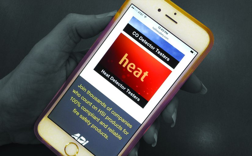
When it comes to a responsive site, brand logos and images must work well at many sizes. On large monitors, images can be over 1024 pixels wide, while older smart phones could be as small as 480 pixels wide. One tip is to size and crop images for mobile first and then create the matching larger sizes. Logos and images viewable at small sizes will easily be viewable at larger sizes.
Another tip to keep your brand images looking their best: wherever possible, work with images taken together. Consistent lighting, product colors and perspectives go a long way to achieving brand consistency â and at the same time, make it visually appealing for mobile visitors quickly scanning and scrolling sites for information.
Typography
With the time spent on smaller mobile device screens, easy-to-read, clean typography is a key design element to set your brand apart. The good news is that there are more font choices than ever and these fonts donât need to reside on a userâs system to be displayed properly â meaning marketers have more options for keeping online fonts consistent with those used in printed brand materials.
But beware of using very thin fonts or light gray colors. These make the type harder to read on mobile in various lighting conditions, and ultimately will reflect poorly on your brand.
Many of our clients find online brand success by mixing two to three font styles and weights, with an occasional large attention-getting bold headline or quote provides visual variety and interest.
Easy-to-Find Content
As mentioned earlier, with more B2B product searches done on mobile devices, easy-to-find content on your mobile responsive site is key to delivering a good user experience.
A positive brand impression starts first with a clearly mapped out navigation strategy. For example, duplicating the main site navigation at the top and bottom of the page makes it easier for visitors to quickly find what they need.
Keep navigation to no more than eight options. For mobile visitors, more than eight transforms a simple scannable list into a never ending scrollable list that canât be viewed all at once.
Make key content easy-to-find within the first or second layer of navigation. Mobile visitors donât want to go down a proverbial rabbit hole of multiple clicks to find content. Another way to draw attention and highlight relevant content is through the use of color backgrounds or color blocks alternating with copy on white.
Effective Contact Options
For many sites, the next natural step after a positive brand experience is to contact the company for more information. Since the Contact Us page is often the most visited page of a site, give care and thought to the mobile responsive version too.
People will often pull up your site on their mobile phone while driving to your location for directions. Put your phone number and physical street address prominently on your Home and Contact Us pages so itâs easy to find.
And if you employ a form on your Contact Us page, remember readability and ease-of-use are king for mobile usage. Mobile site visitors prefer short forms with drop-down options that keep typing information to a minimum.
With a mobile responsive website, youâll give your site visitors a better, easier, and more enjoyable experience â and leave a long-lasting positive brand impression.
Looking for other ideas to boost your brand? Contact us for a brand consultation!